Brand Identity
for Music by Eras
Music By Eras is a performance collective that creates and produces era-specific tribute bands for live events, concerts, and private functions. Each show is built around a distinct moment in music history, with its own sound, references, and visual language. It’s rooted in the idea that music can transport us — not just sonically, but culturally — and that a great performance can bring an entire moment in time back into focus.
Early on, we explored directions rooted in psychedelic and festival-inspired visuals, as well as more contemporary, institutional branding. Both had their merits, but neither quite landed — one felt too fleeting, the other a bit too removed from the emotional core of the music. The direction we arrived at pulls more from classic venue posters, record label marks, and the kind of rock and roll that never really goes out of style.
The goal was to build a system that could be cohesive at the top level, but flexible enough to support a range of distinct voices underneath it.
PROJECT SCOPEVisual Strategy
Brand Identity
Logo Design
Typography
Motion Design
Logo System
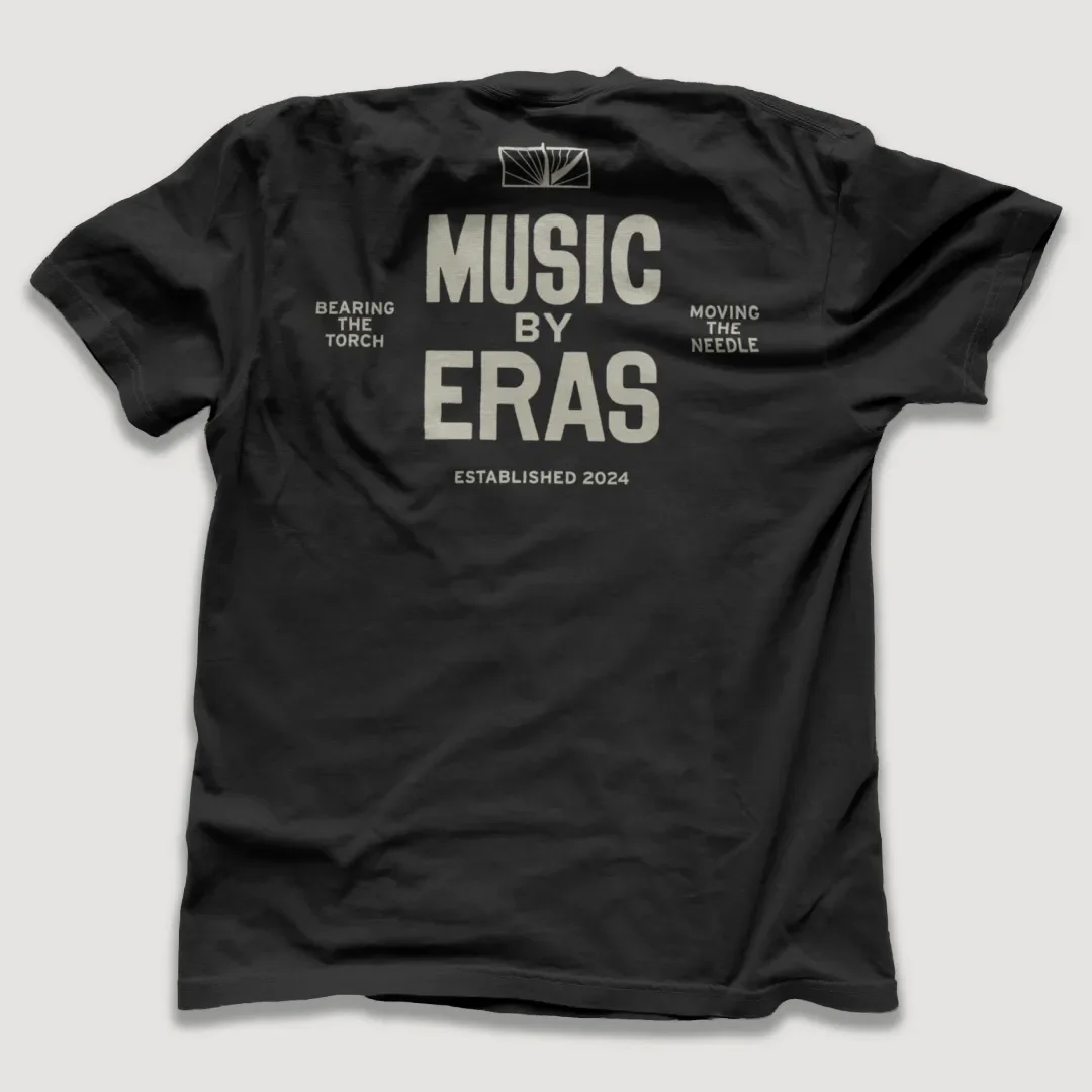
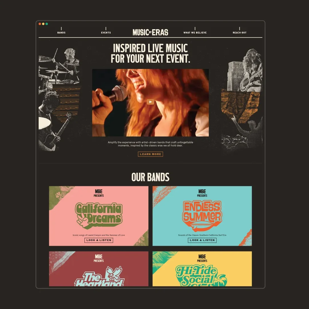
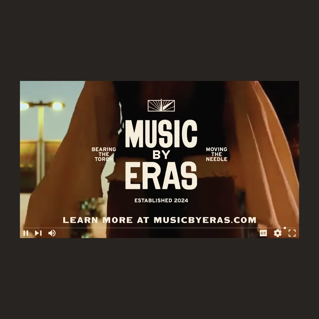
The logo system is built to be flexible. At its core is a bold, straightforward wordmark with variations that can expand or contract depending on the moment — from large-format applications to tighter digital spaces.
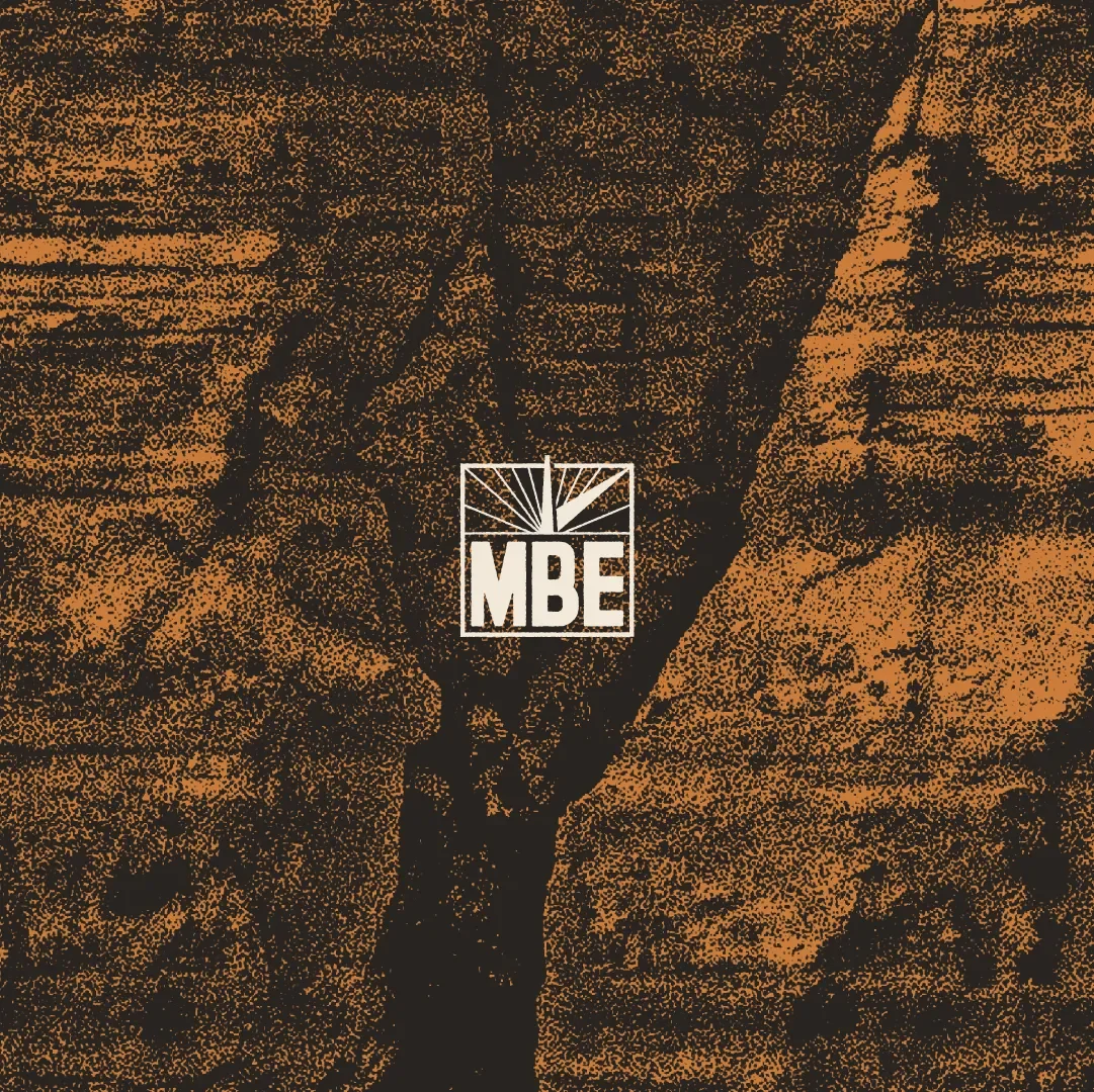
The dial-inspired icon draws from a lineage of classic record label marks and venue signage — something sturdy, recognizable, and built to last. The goal was a mark with presence, but enough flexibility to move with the brand across different contexts.
Color
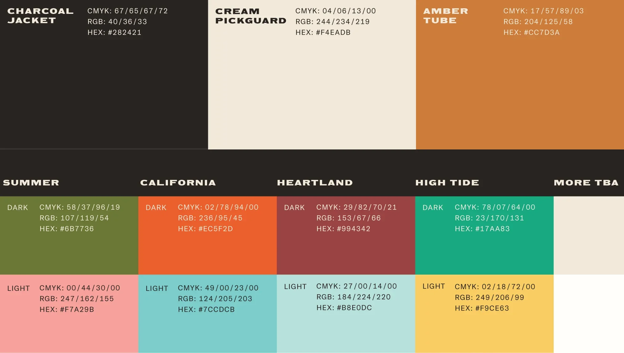
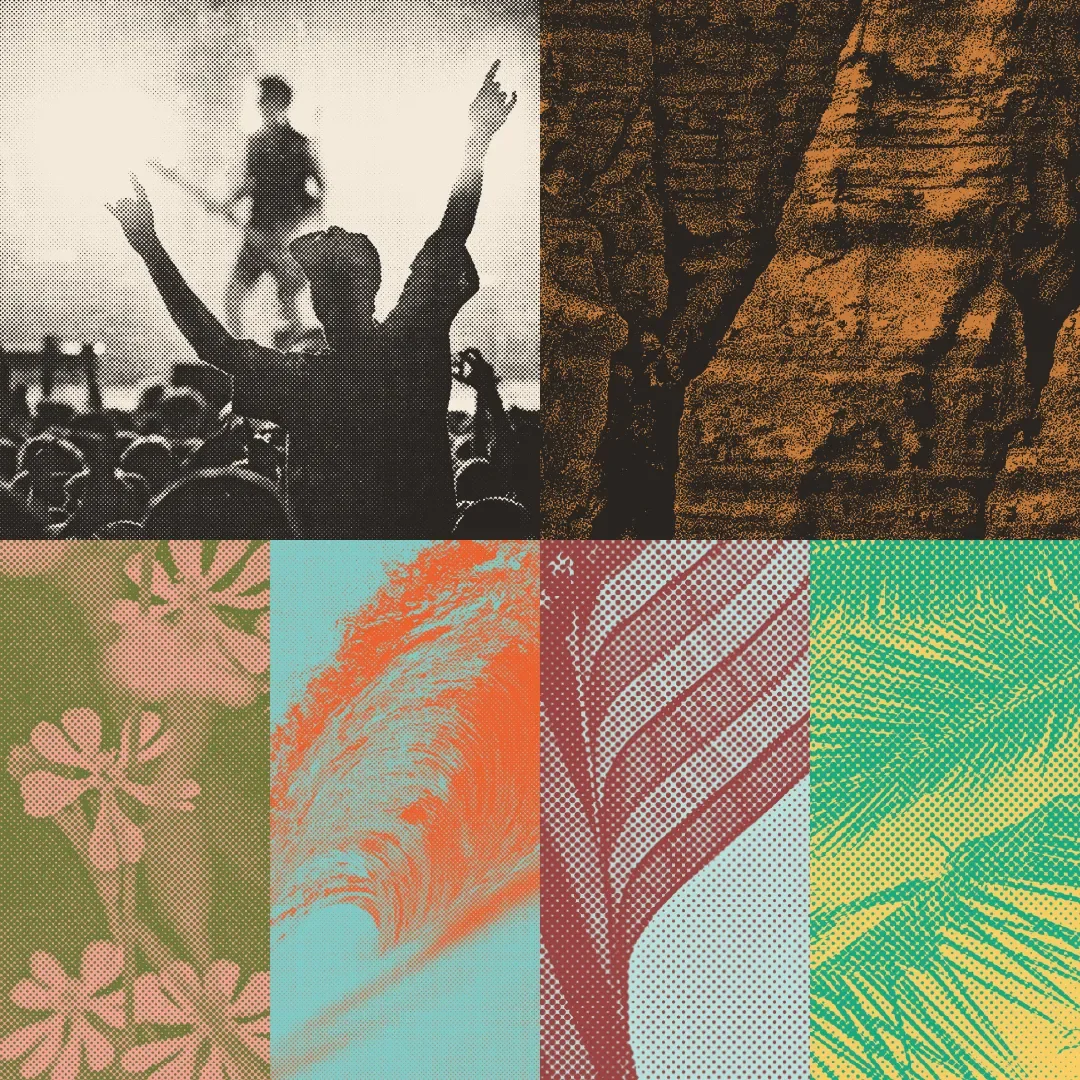
The color palette sits somewhere between past and present. The core tones pull from a kind of golden age of recorded music — amps, faceplates, worn-in materials — while still feeling clean enough to live in a modern context.
Each band is assigned its own two-tone palette, with a light and dark value tuned to its specific era and genre. This creates contrast and variety within the system, while still keeping everything under the same roof.
Typography
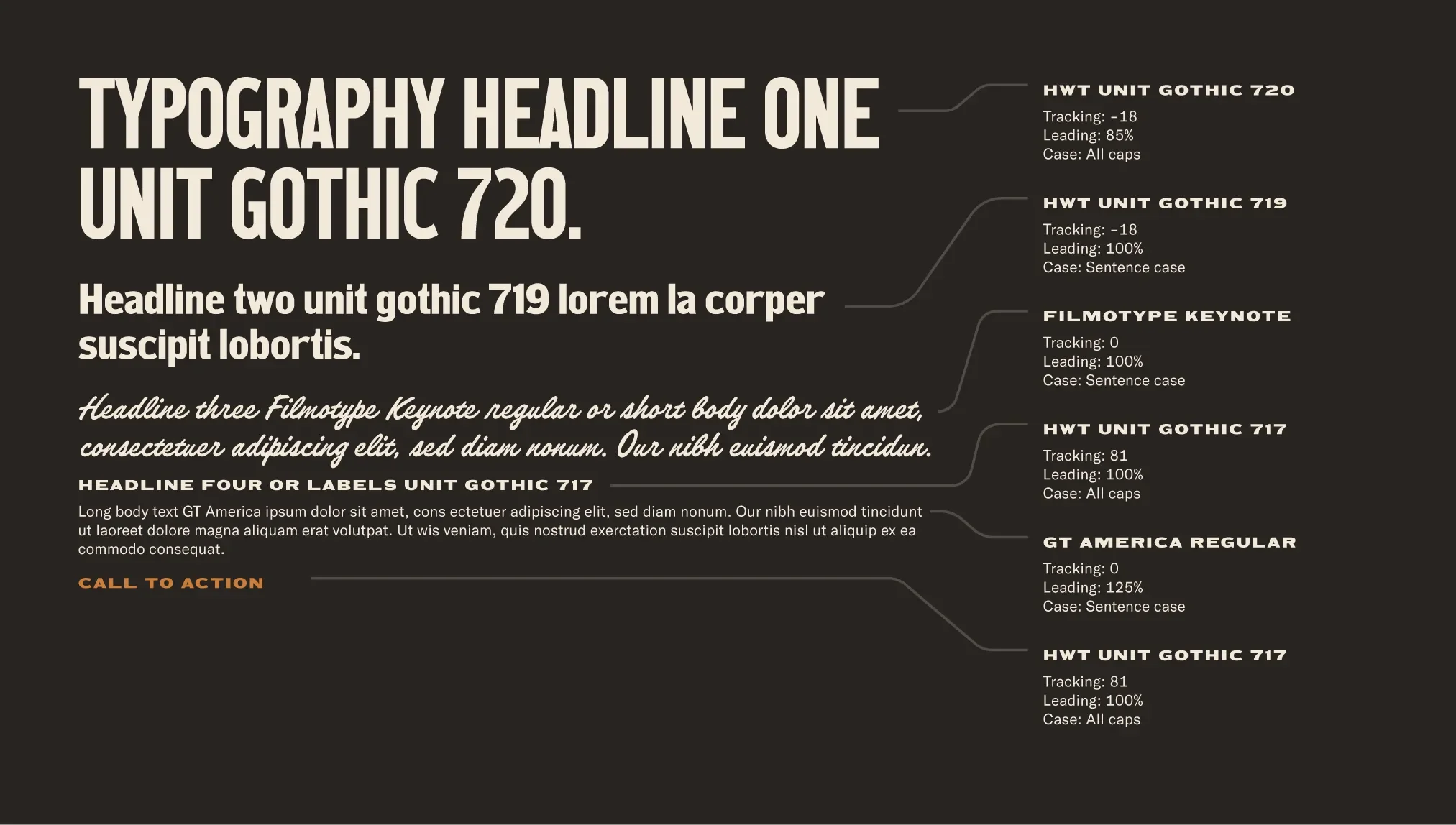
The type system takes cues from protest signage and cultural movements — bold, direct, and meant to be seen from a distance. Unit Gothic acts as the backbone, carrying a kind of blunt, rock-and-roll energy.
Supporting typefaces soften and expand that voice. A script inspired by amp logos and guitar headstocks adds a bit of looseness, while the overall hierarchy is built to work everywhere — from printed materials to motion and screen-based applications.
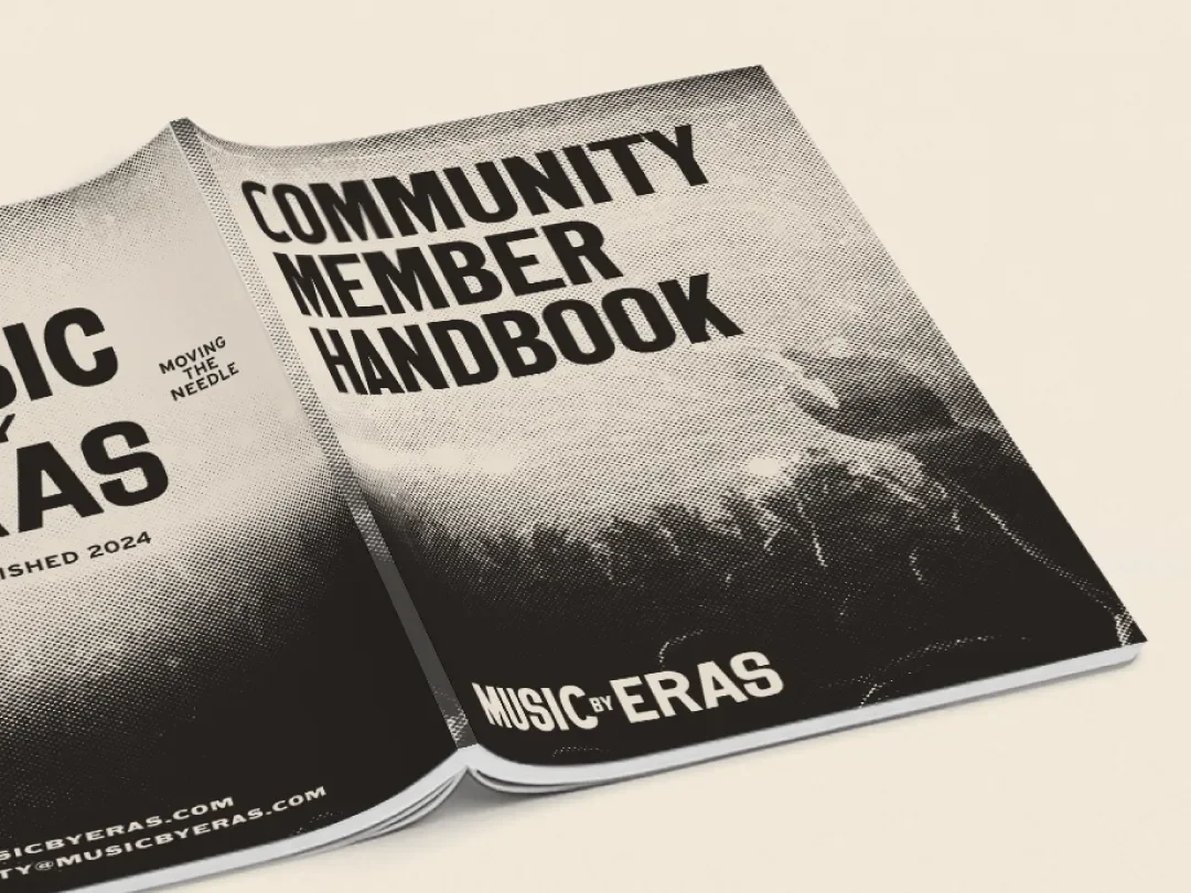
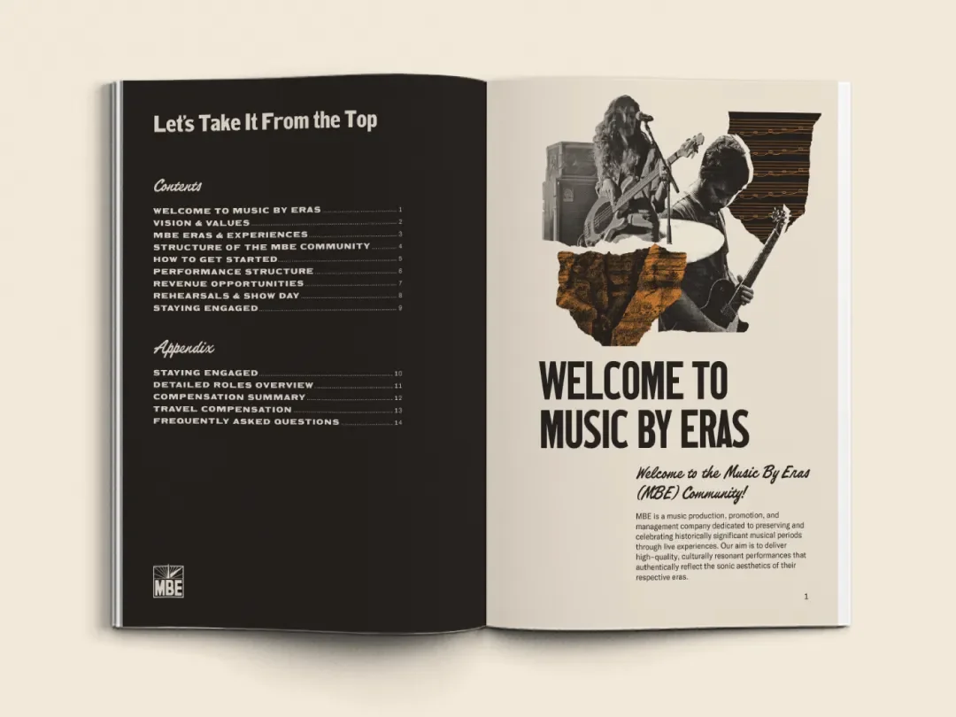
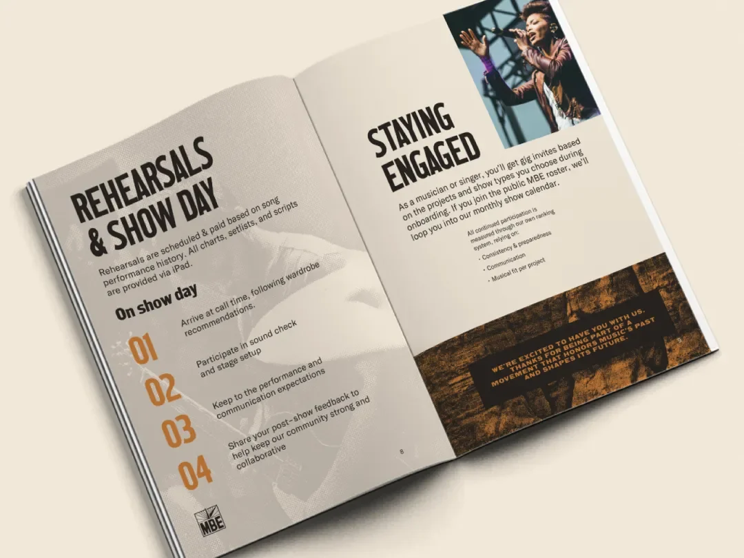
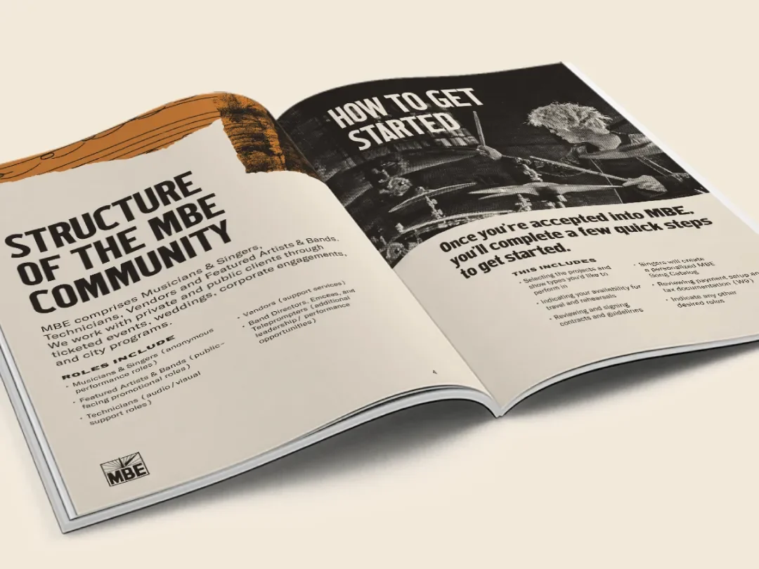
Community Handbook
The community handbook acts as a kind of entry point into the brand. It’s something each artist receives when they join, and it lays out the visual language alongside the thinking behind it.
It puts the system into practice — type, color, imagery — while also telling the story of what Music By Eras is trying to do. In that sense, it’s both a functional document and a piece of brand storytelling.
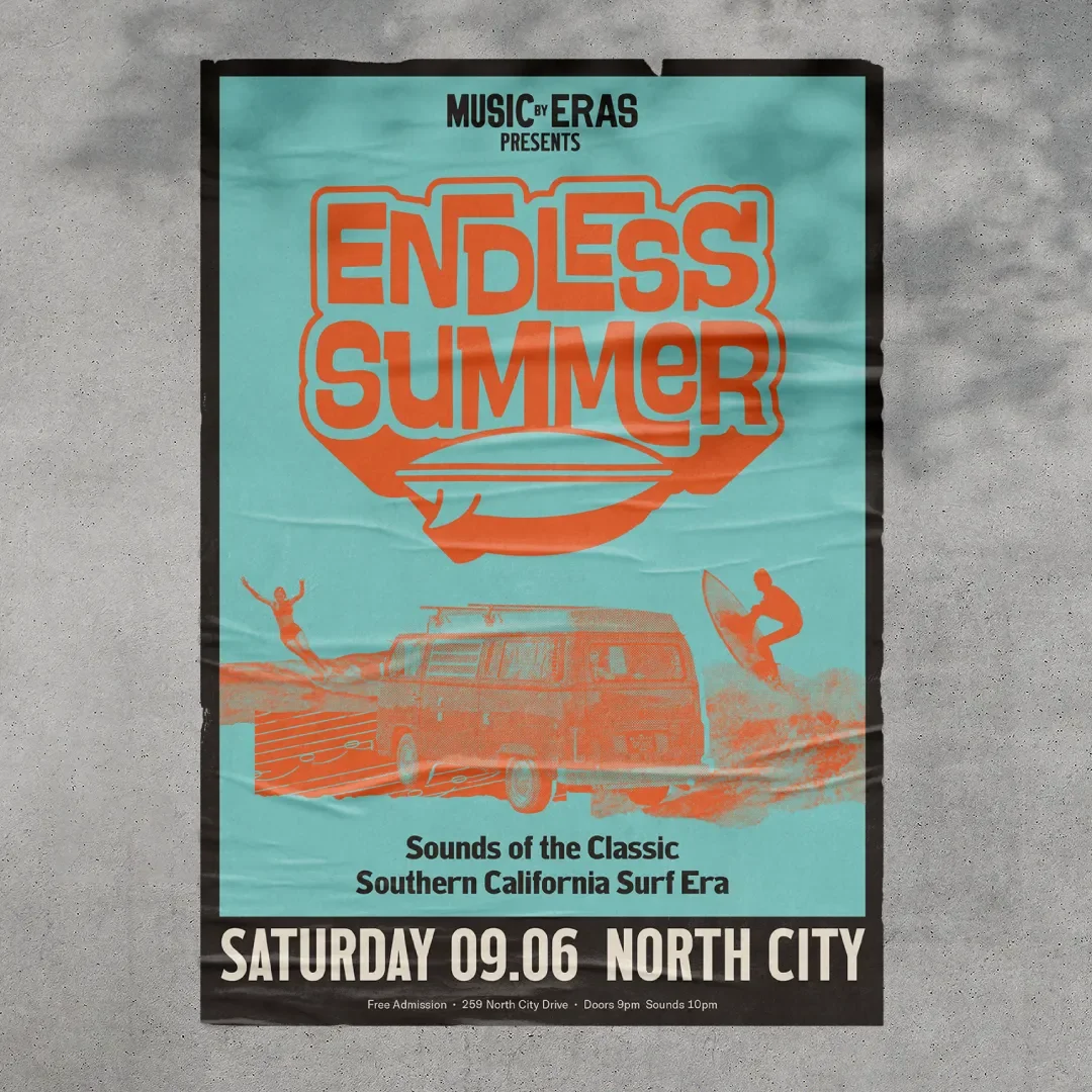
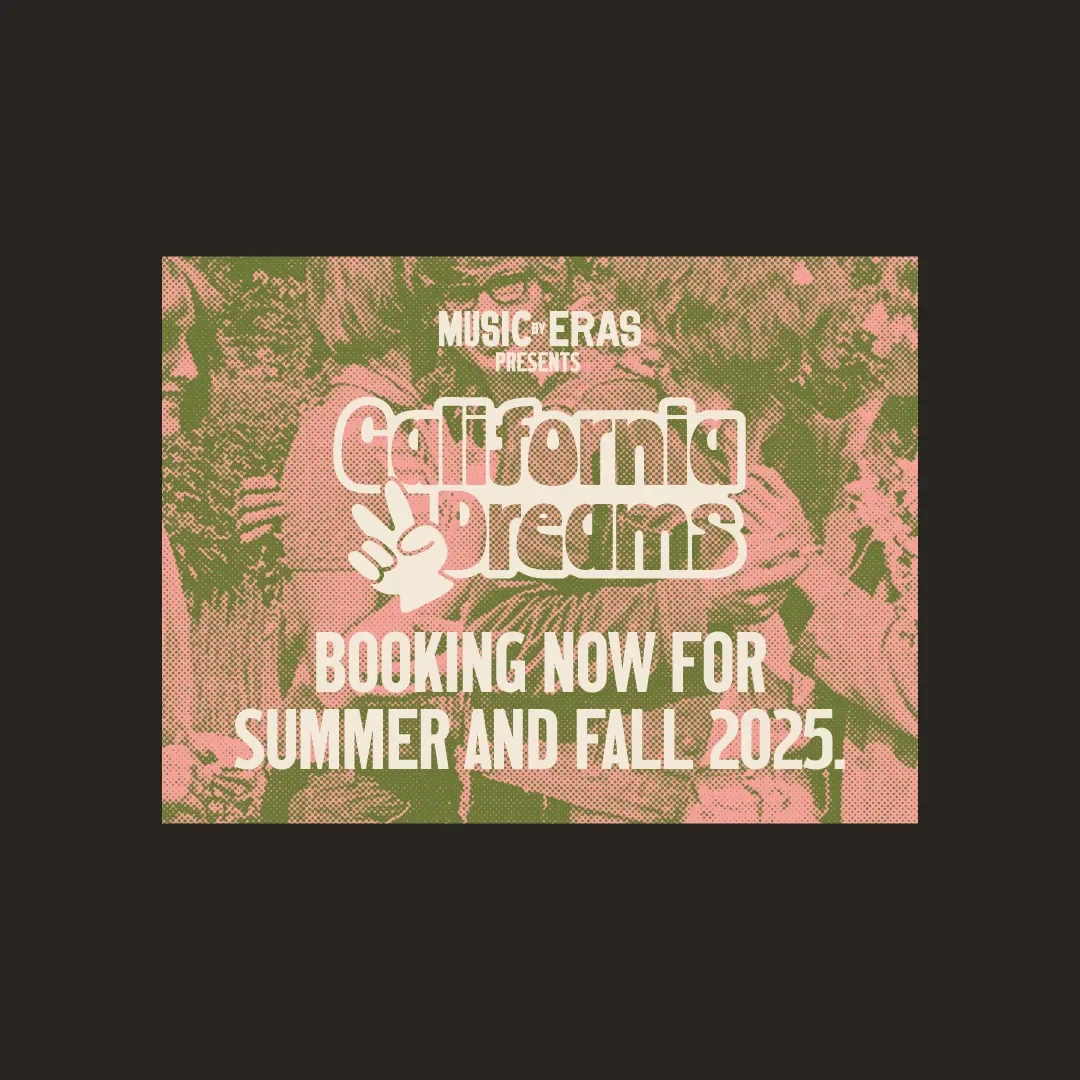
Sample Applications
These applications were developed as a way of pressure-testing the system. The goal was to see how the identity held up across different formats and contexts, and where it needed to stretch or tighten.
Each pass revealed something — a new opportunity, a small inconsistency, a better way forward. Over time, those iterations helped shape a more cohesive and defined visual language.
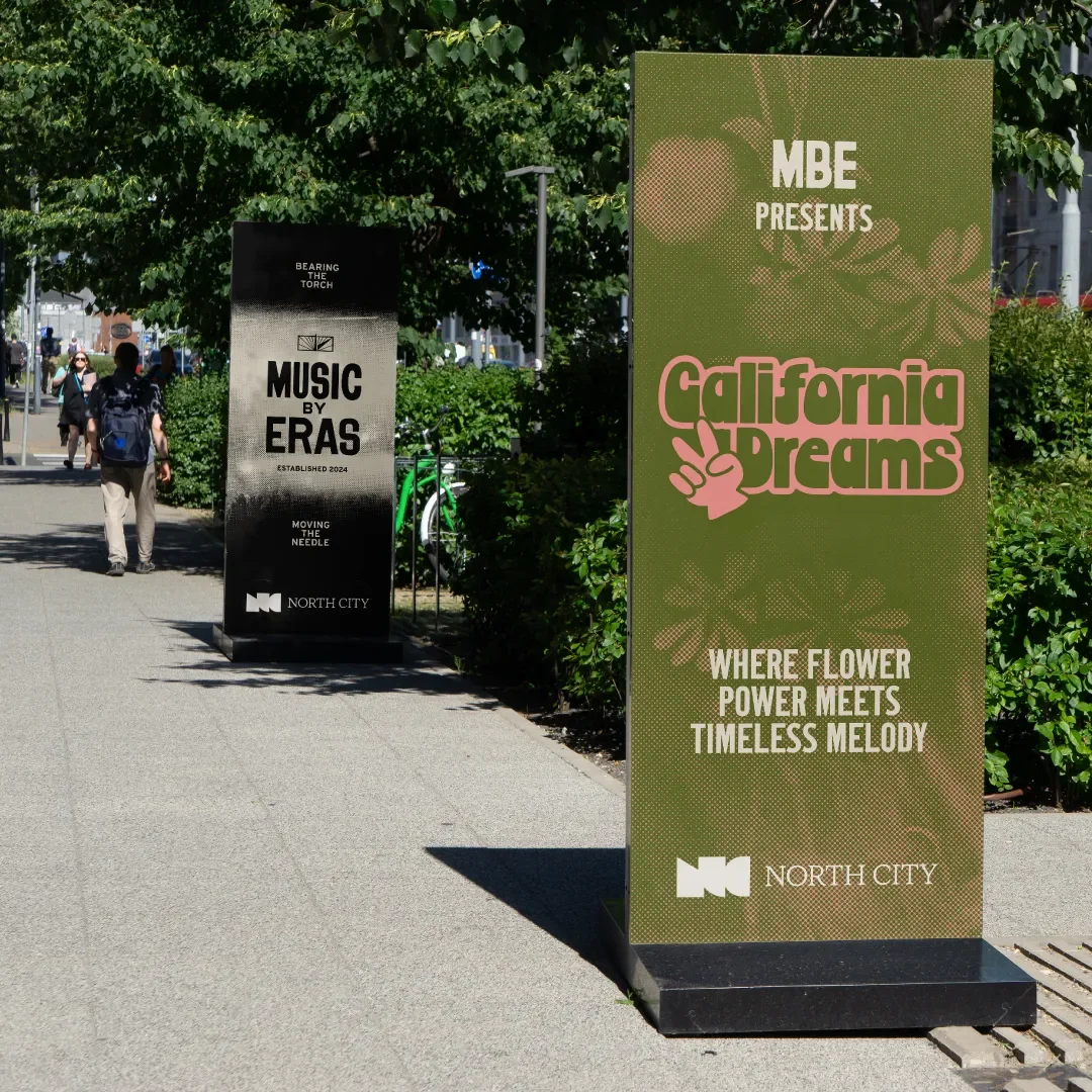
Band Badges
Each band within Music By Eras operates as its own distinct offering, so we developed a set of badges to reflect that. These function like mini-identities — rooted in the band’s specific color palette and tuned to the visual language of its era.
At the same time, they needed to sit comfortably within the larger system. We often talked about it like a brewery: individual beers with their own character, all coming from the same place. That balance — variation within consistency — became a central idea throughout the project.
Performance footage courtesy of Music By Eras.
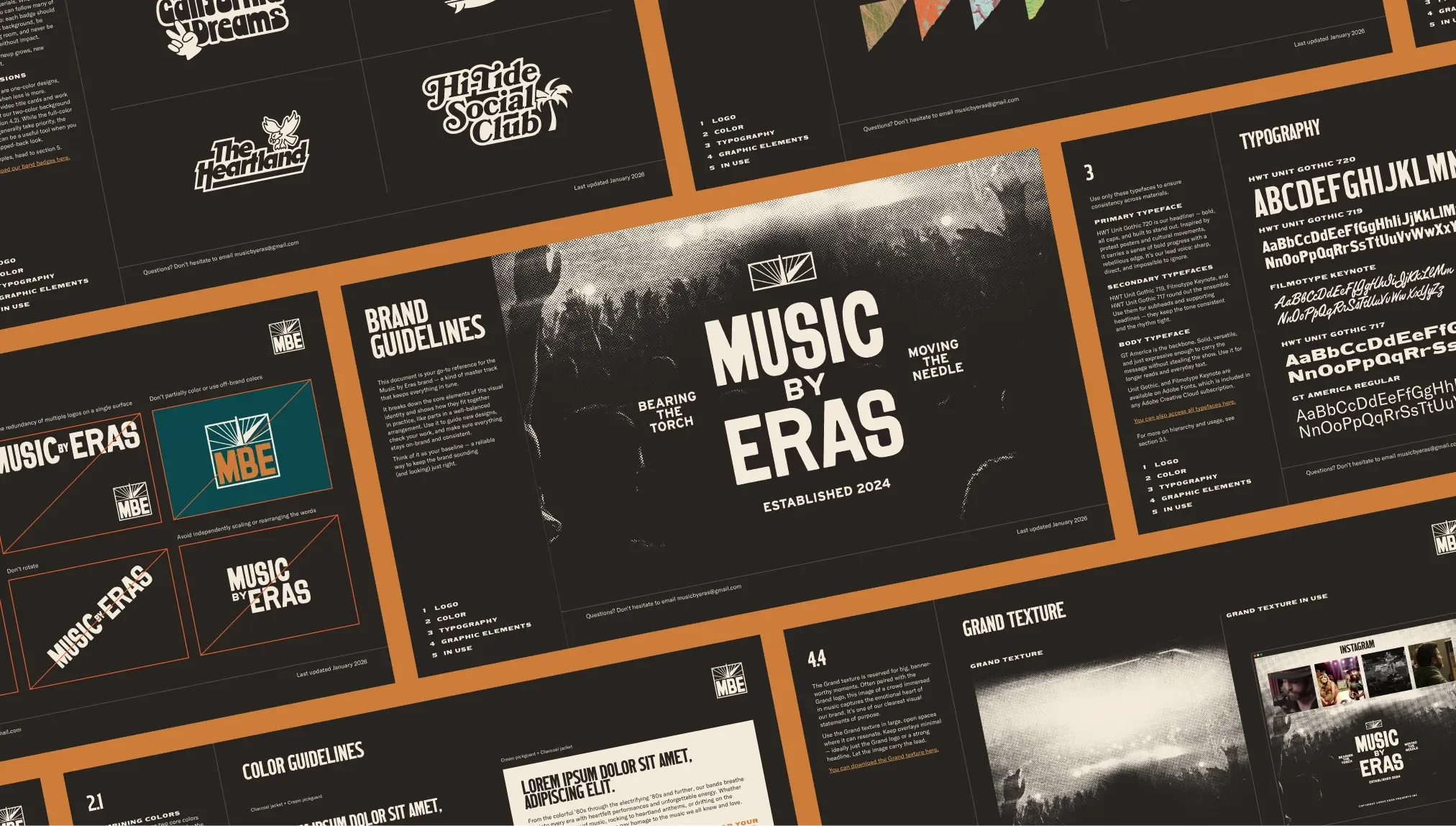
Brand Guidelines
All of this work is ultimately captured in a set of brand guidelines. The document outlines how the system works — logos, type, color, imagery — and how to apply it consistently across different contexts. It’s paired with a structured library of assets for both print and digital use, so the brand can hold together even as it moves through different hands.